OSC Design Studio
A Church that exists to help people Know God, Find Freedom, Engage Community, and Share Your Story.
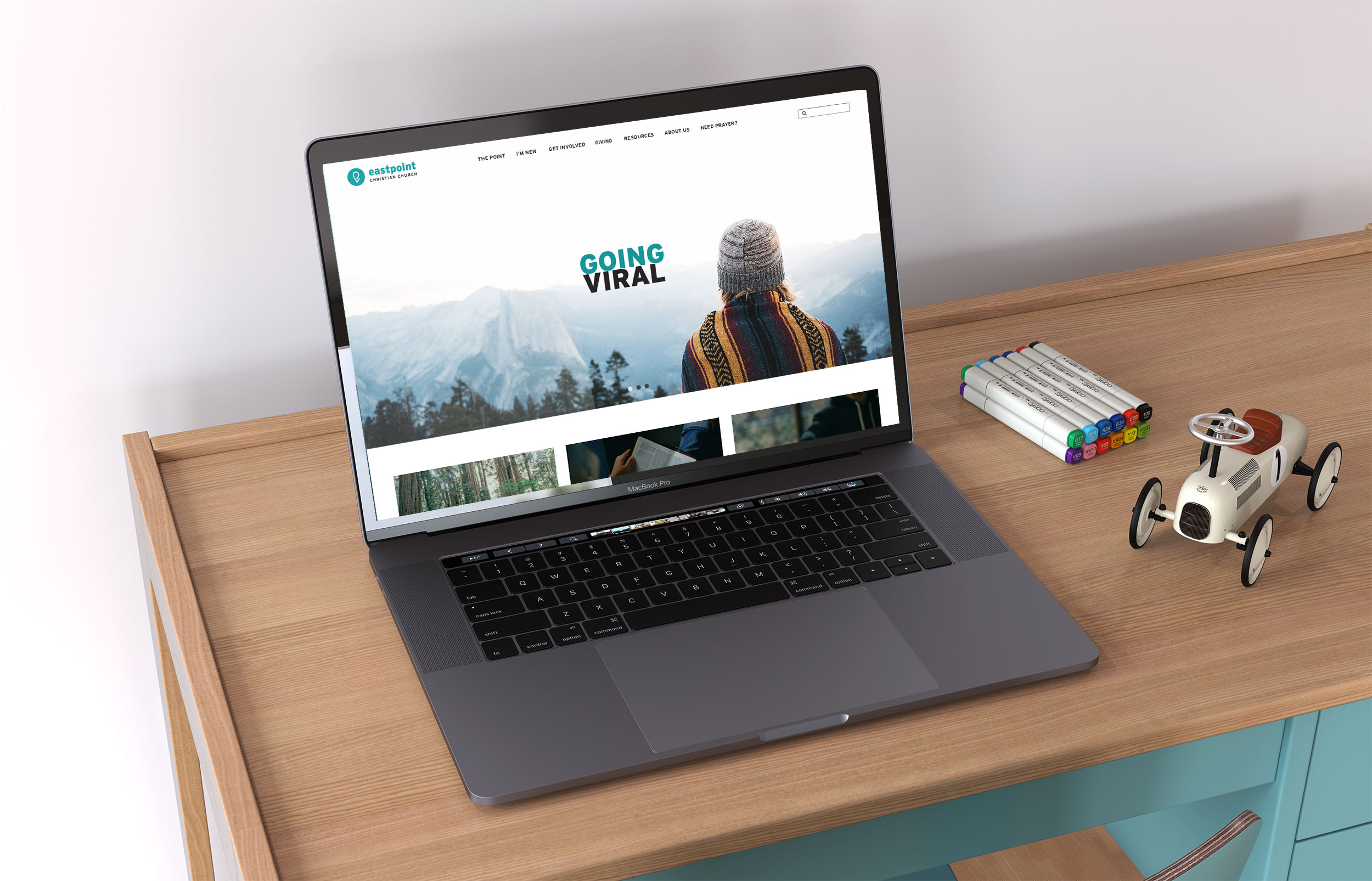
Project: Website redesign
My Role: UI/UX Designer (Collaborated with OSC team who did the website development and search engine optimization)
Responsibilities: UX Research, Persona generation, Prototyping, Visual design
Challenge
When users are searching for a new church or event, the website is an important deciding factor. The existing Website was too busy, especially in the navigation menu. Very static, not engaging as far as graphics or movement. The website was difficult to navigate and information difficult to find in the clutter.
Solution
Create a very clean user-friendly website utilizing white space where possible and getting the message across. Design a cohesive experience that is more useful and easily understood by East Point Church’s customers. Creating a common visual language for teams to work with.
Research
Competitive Analysis
My first step was a competitive analysis of similar organization websites to assess features worth considering for the East Point Church’s website redesign. I looked into The Rock Church, Hillsong Church, Saddleback Church, and Vineyard USA. The main takeaways from the analysis were as follows:
• Competitors provided users with a significant amount of information about their events so they knew what they were signing up for.
• Each competitor gave options to skip certain steps and did not prompt users to do certain actions if not required at the time.



User Research and Persona Creation
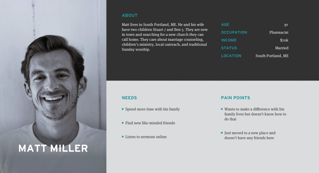
My target group was families with elementary-aged kids. I interviewed two people, those who desire to make a difference in their lives. Young adults who are seeking a place to belong with others who are like-minded. Based on findings from the interviews, I made a user persona in order to design the best solution for my target audience.
Design
Wireframes
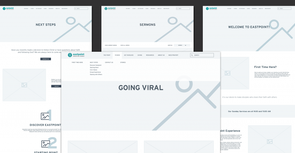
The next part of this project was to optimize the information architecture of the site, starting with the creation of clear navigation then determining the pages and content for the new site. I organized and replaced hyperlinks with clear CTA buttons. I used a mega menu to allow users to visually compare all their choices.
High Fidelity Prototype
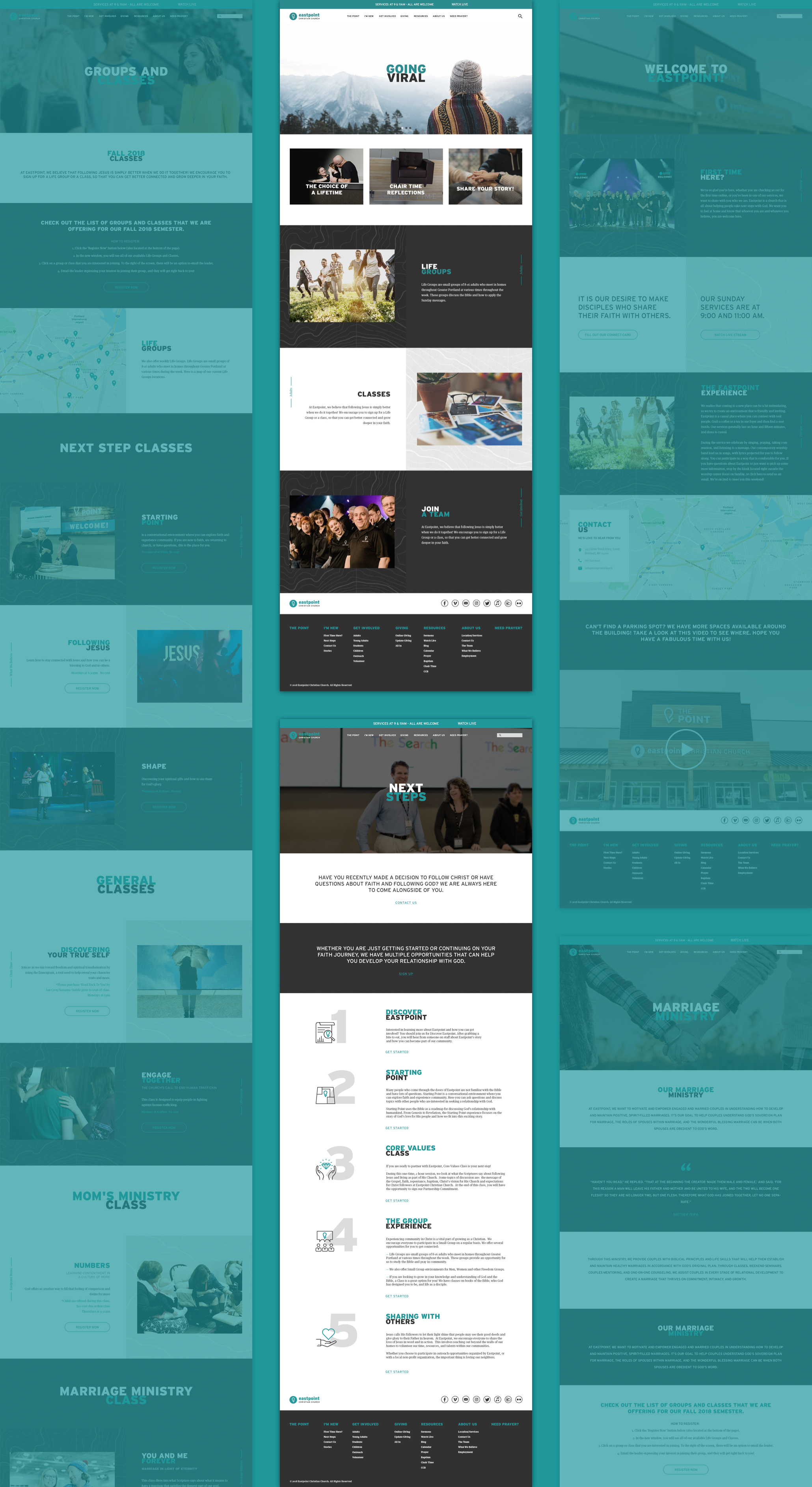
We presented the wireframes to the client, and following the feedback and approval, I began working on high fidelity wireframes in preparation of prototyping. The client already had a design style guidelines so my goal was to create and implement a design system in compliance with established templates and design standards.
Reflection
My next steps would be to test the usability of the website. After that I would redesign the whole registration process. I’d also like to dive dipper into information architecture.
