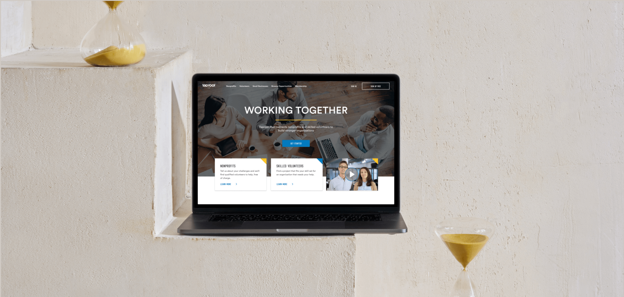
Project overview
92% of nonprofit organizations report a lack of critical resources. Taproot helps mission-driven organizations amplify their impact by mobilizing skilled volunteers to advance resource equity. Taproot Plus is a free matchmaking platform that allows nonprofits to connect directly with skilled volunteers.
Timeline: December 2019 — January 2020
Challenge
Based on the activity report, we observed that in 2019, 11,357 users registered as volunteers, but only 2,110 are currently active. Through a heuristic evaluation and usability testings, it became evident that users face challenges in recovering from accidentally creating a nonprofit account instead of a volunteer account. Additionally, there are issues with the system, including occasional failures to send email confirmations and persistent requests for email address confirmation with each sign-in attempt.
Goal
Assist volunteer users in navigating the process of creating accounts and successfully applying for projects.
Solution
Create a clean, user-friendly onboarding flow that effectively utilizes website space to guide users through the account creation process. Design a cohesive and easily understandable experience for Taproot Plus users, establishing a consistent visual and verbal language that empowers professionals to donate their time and effectively support nonprofit organizations.
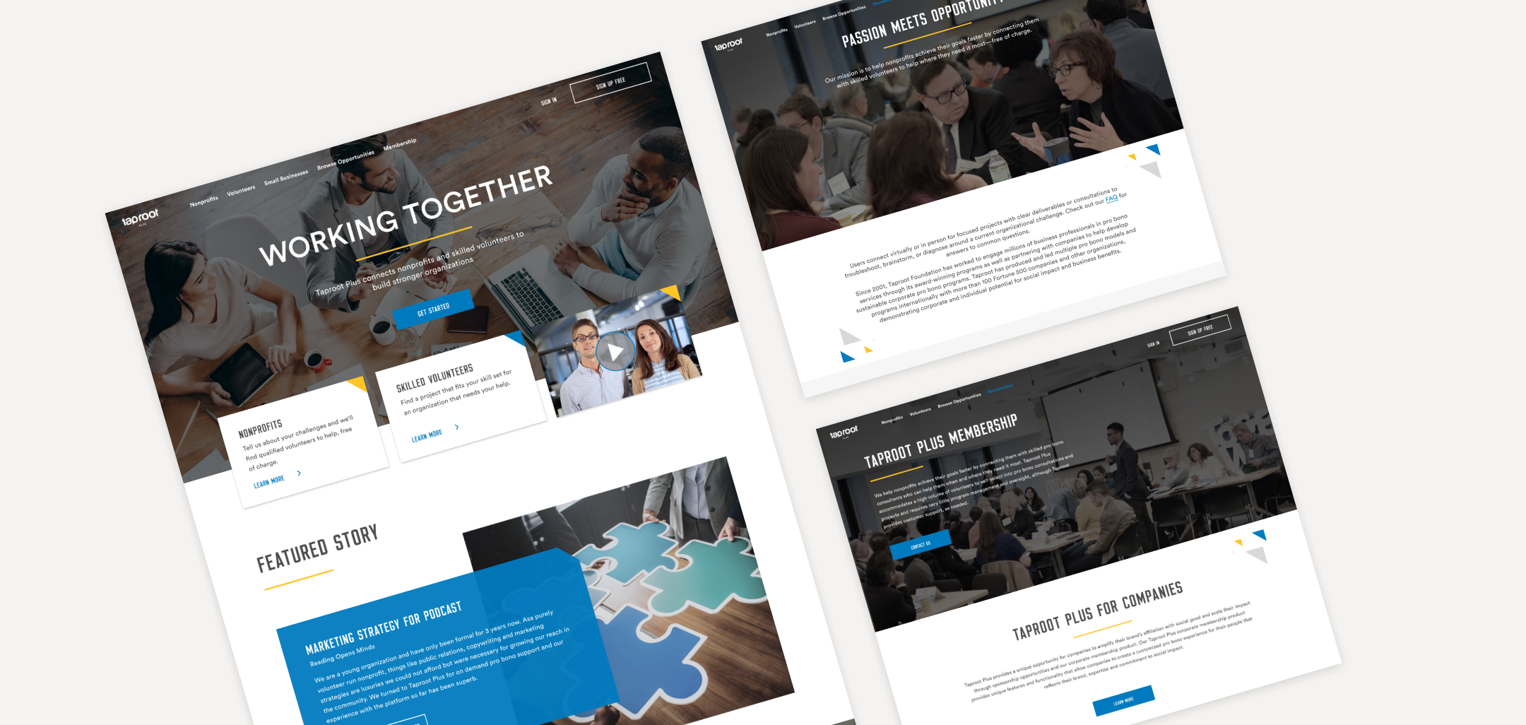
DISCOVERY
Techniques used:
- User surveys
- Usability testing
- Heuristic evaluation
- Comparative Competitive analysis
- Affinity Mapping
- Feature Prioritization
User surveys and Usability testings
I initiated by conducting a user survey to comprehend user perspectives and identify challenges they encounter. Next step was usability testings to observe user behavior and understand their actual interactions.
Key Takeaways
- Users were unsure about navigation on the website and the process of signing up as volunteers.
- Only one person noticed they could select “For Volunteers” or “For Nonprofits” while creating an account.
- All users made several attempts to create a password before it passed a complexity test. The password strength indicator wasn’t working well so they had to guess.
- Most users couldn’t find projects fitting to their skills.
- Four users expressed concerns about trusting organizations that utilize Taproot Plus, particularly when they repeatedly post the same project.
- It wasn’t clear whether elements are clickable or not.
- Users believed they could only submit applications for projects within their specific location.
Recommendations
- Improve skills section by organizing and adding more skills.
- Improve the password-strength indicator.
- Provide more information about Taproot Plus and Nonprofits we work with (on the Home page.)
- Add clear CTA buttons with keywords.
- Add hover state for all clickable elements.
- Separate Volunteer and Nonprofit experience.
- Specify whether projects remote or in person.
Heuristic evaluation
The next phase was a heuristic evaluation where I analyzed the Taproot Plus account creation flow. Employing Jakob Nielsen’s 10 usability heuristics, I aimed to pinpoint potential challenges users might encounter, ensuring alignment with industry standards.

1. Users have to guess the password complexity or try multiple times. 2. If a volunteer accidentally creates an account as a nonprofit — there is no other way to recover except to contact us. 3. Users have to scroll to see “Sign Up with LinkedIn.”
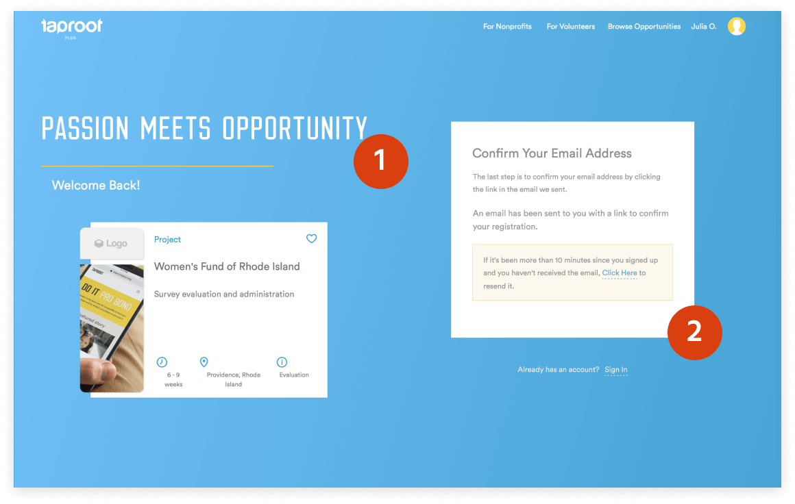
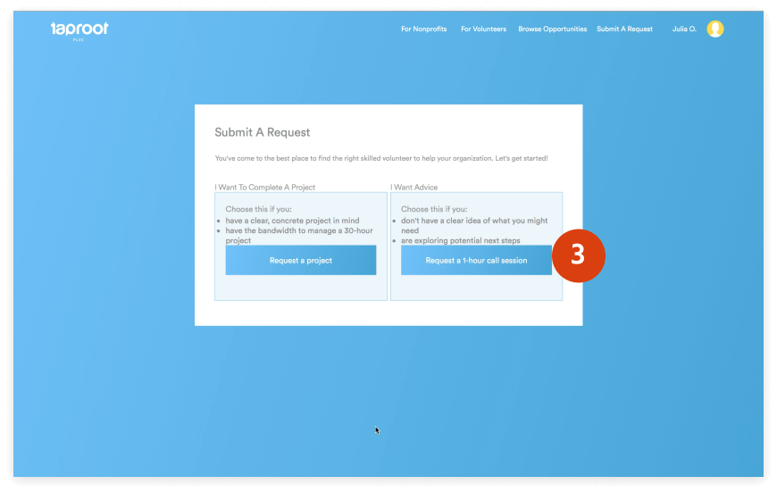
1. Lack of contrast – Accessibility violation according to WCAG 2.0 Compliance. It requires a contrast ratio of 3:1 for UI components. A contrast ratio for some colors is 1.31 or less. 2. Users receive an email confirmation before, before actual email confirmation. 3. UI elements are not aligned. 4. Website is not responsive – 25 % of our users use mobile devises.
Affinity Mapping
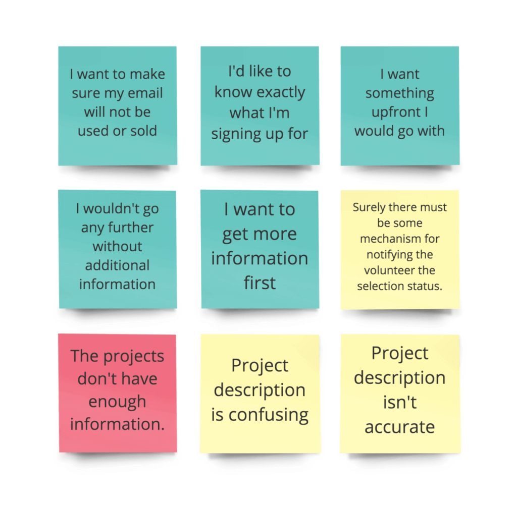
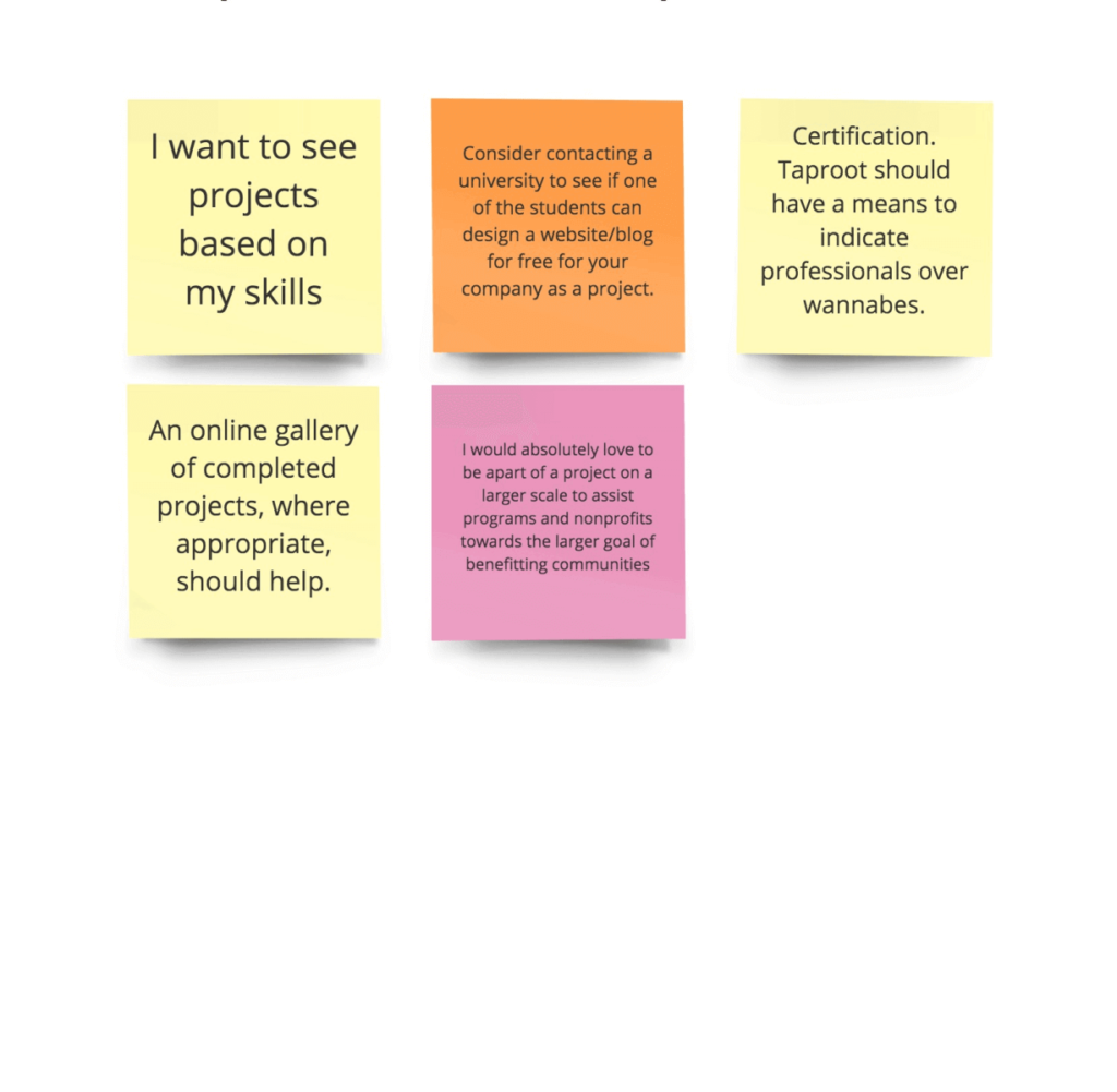
After gathering up enough information from user interviews and surveys. I used a method called Affinity Mapping to consolidate the data and insights that I found from each individual. I then categorized these findings into “I” statement segments to get a clear and better understanding of where I needed to focus my efforts when going into the design process.
I want to be informed about each stage of my experience.
I want to have personalized experience.
I want to be heard
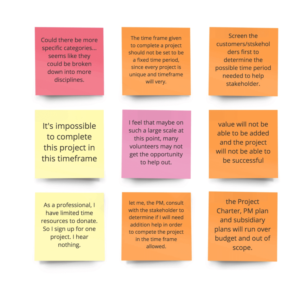
Key Takeaways
- Users want to get accurate information about projects.
- Users want to know what they are signing up for and status of their application.
- They want to get clear directions.
- They want to affect the project scope and timeline.
User Research and Persona Creation
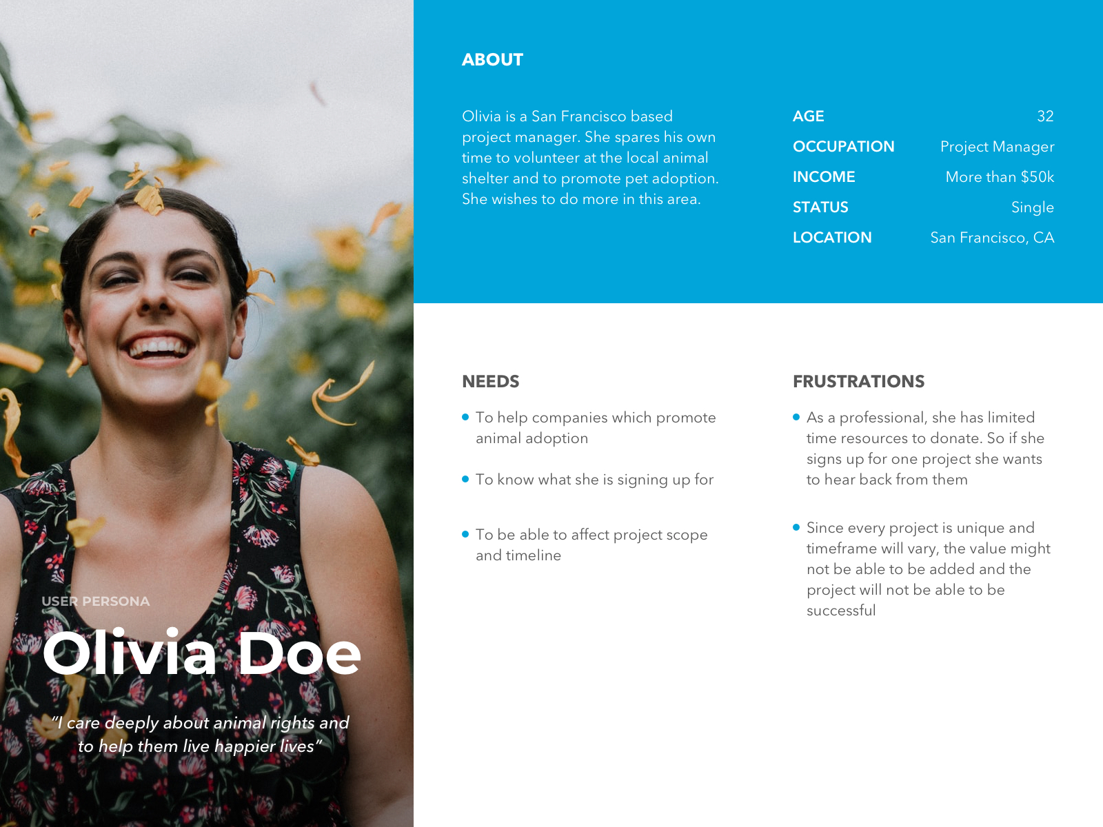
In my research, I discovered that the primary target audience comprises dedicated professionals willing to contribute their time to make a difference for nonprofit organizations. Demographic data revealed that 40% of users fell within the 25-34 age range, and 60% of users were female. Furthermore, incorporating insights from user surveys and interviews, I created a user persona to inform the design of an optimal solution for my target audience.
Feature Prioritization
Based on the trends I identified during the research, I narrowed a list of demands and features. I used the MoSCow method to prioritize features. MoSCoW method was designed as a prioritization framework for time-boxed projects.
Must-Have
- Update the password-strength indicator.
- Clear CTA buttons with keywords.
- Show whether projects are remote or in-person.
- Separate Volunteer and Nonprofit experience.
- Update UI elements: colors, fonts, icons, alignment.
Should Have
- Provide more information about Taproot Plus and Nonprofits we work with on the Home page.
- Add hover state for all clickable elements.
- Prevent posting the same project multiple times.
Design
Overview
Based on all my research foundings, I’ve put together an updated user flow for easier and flawless onboarding. Created a high fidelity prototype, then run a few iterations of usability testings and moved design to the production. Here are some of the redesign updates overview and insights from the prototype usability testings:
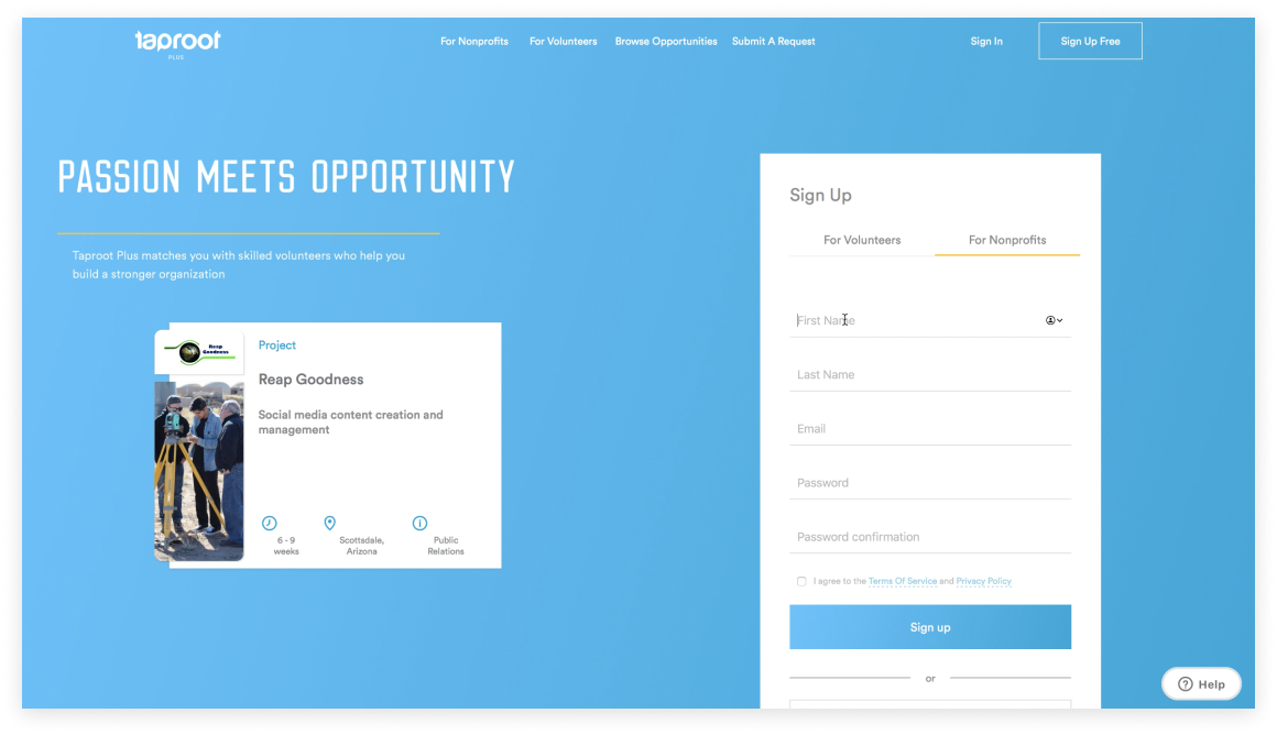
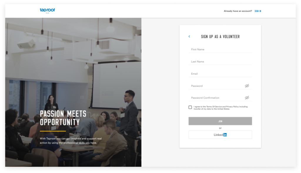
1. Made an account selection a separate step. 2. Added a password-strength indicator and show/hide icon. 3. Addressed contrast accessibility issue. 4. Made LinkedIn button visible.
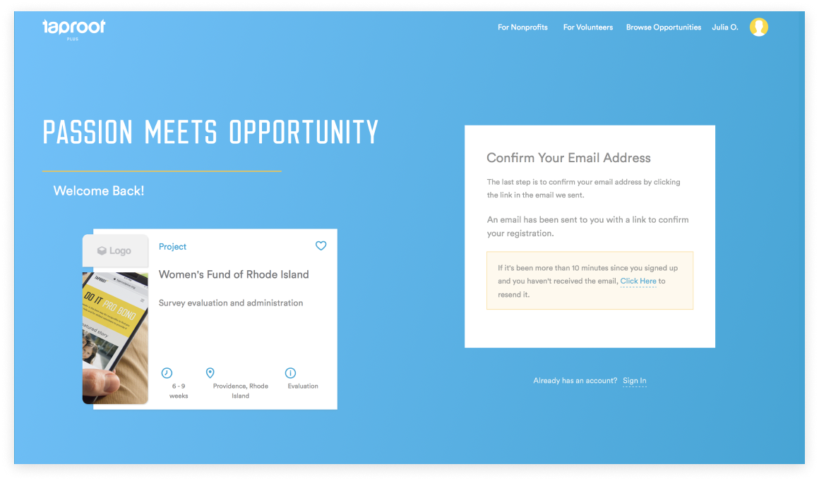
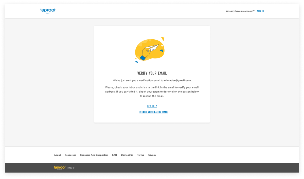
1. Added clear description and instructions. 2. Showed email address so users can check whether there is any typos in case they don’t receive the confirmation. 3. Added ‘Get Help’ and ‘Resend Verification’ options.
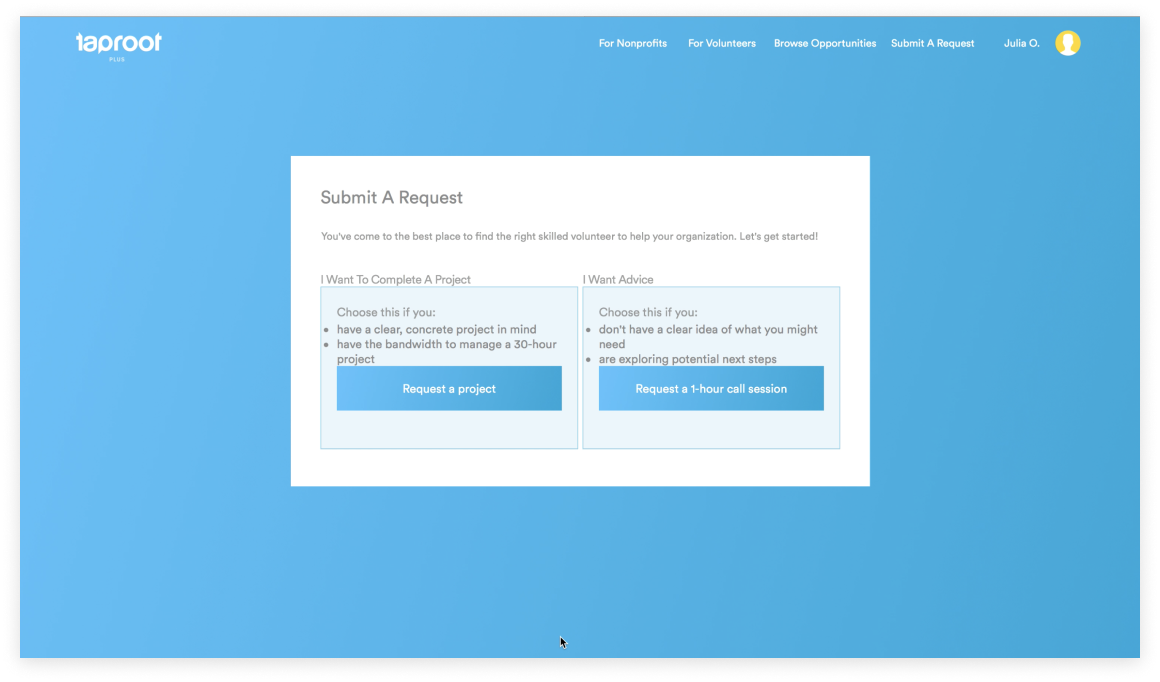
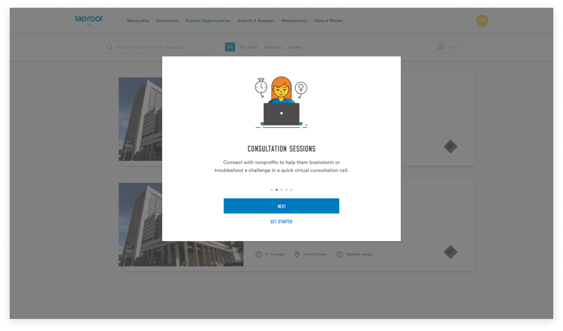
1. In the original workflow, users had to select an experience type right after they created an account which was confusing for them. I designed a fun and informative guided tour to inform users about Taproot Plus products before they select them. 2. Updated overall look by aligning elements, adding more contrast, consistent fonts and colors, illustrations, and spacing between elements. 3. Added clear CTA buttons with keywords.
Key Takeaways
- More trust with users, after redesign the activation rate was 15% up.
- Users liked new blue color.
- It with ease to create an account: there are 3 ways to do so.
- Found overall process easy and straightforward.
- It was clear for users whether they’re creating a volunteer or nonprofit account.
Next steps
My next steps were to keep testing, talking to users, and observing them interacting with Taprott Plus to see how they understand the functionality and identify further areas for improvement.
During my research, I discovered that many users struggled to select their skills because of the limited options available. This issue prevented them from finding suitable projects.
Addressing this issue was outside the scope of the current project, so the team and I decided to tackle it in one of our upcoming projects.