Heali
Perfecting Diet Management
Heali is an app that allows users to scan menus to identify what ingredients work within their specific dietary restrictions. Heali’s goal is to make personal dietary management easier
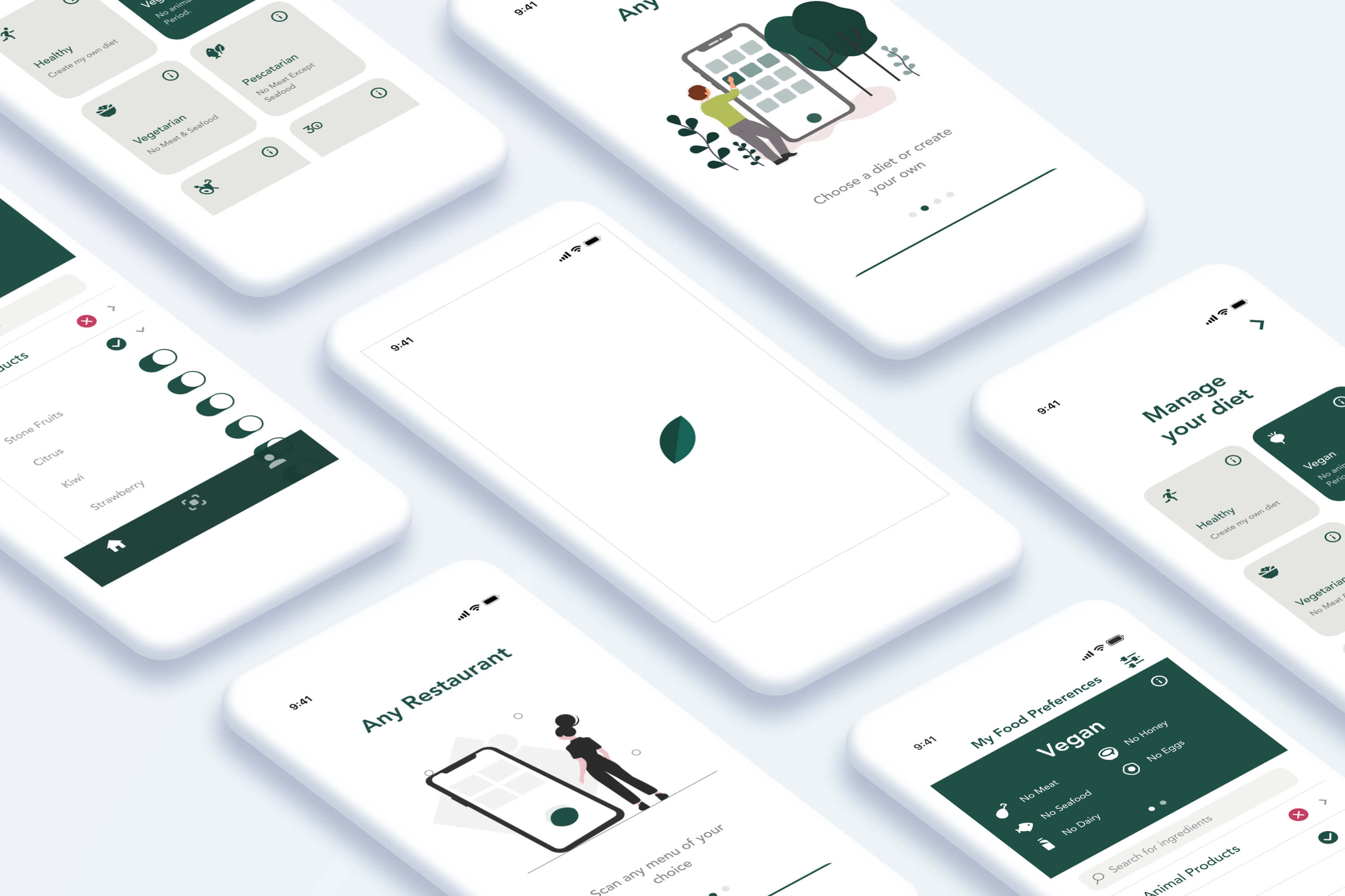
Project: Mobile App redesign
Timeline: 15 Days
My Role: UI/UX Designer (Worked on team of 4. After the group project was finished, I refined the design and redesigned all visual elements.)
Responsibilities: Research, Persona generation, Usability Testing, Prototyping, Visual Design
Challenge
Heali is building a database of restaurant menu information, using data straight from restaurants themselves instead of user-generated data. A part of Heali’s unique offering is a science-backed approach to managing diets through a database created by nutritionists. The original user flow included only two screens which was confusing for users.
“Everything should be made as simple as possible but not simpler.” — Einstein
In addition, an app that combines digital and physical processes — such as scanning a menu as well as back-end system architecture limitations — presents its own set of challenges.
Designing an efficient and intuitive app in these circumstances was a challenge.
Solution
- Create a new user flow with new capabilities.
- Make the app intuitive to minimize training and support costs.
- Provide users with more directions.
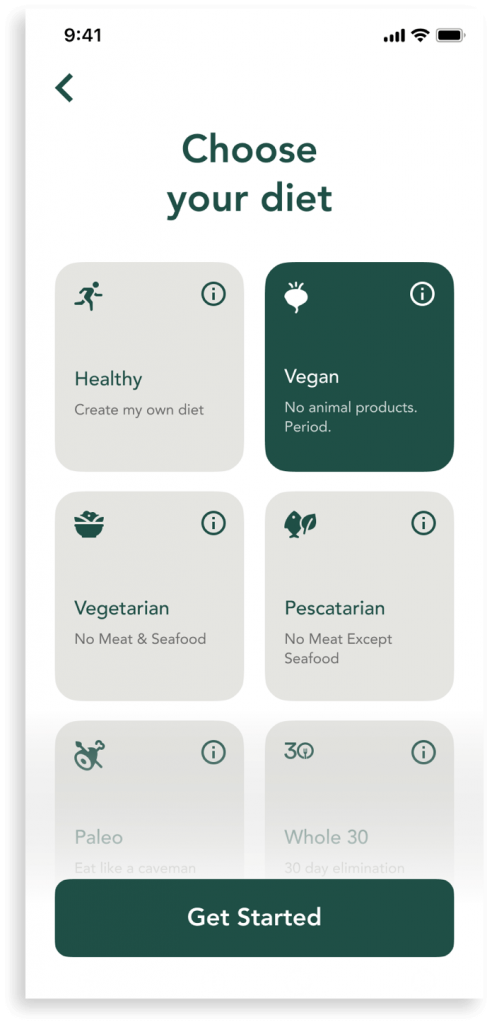
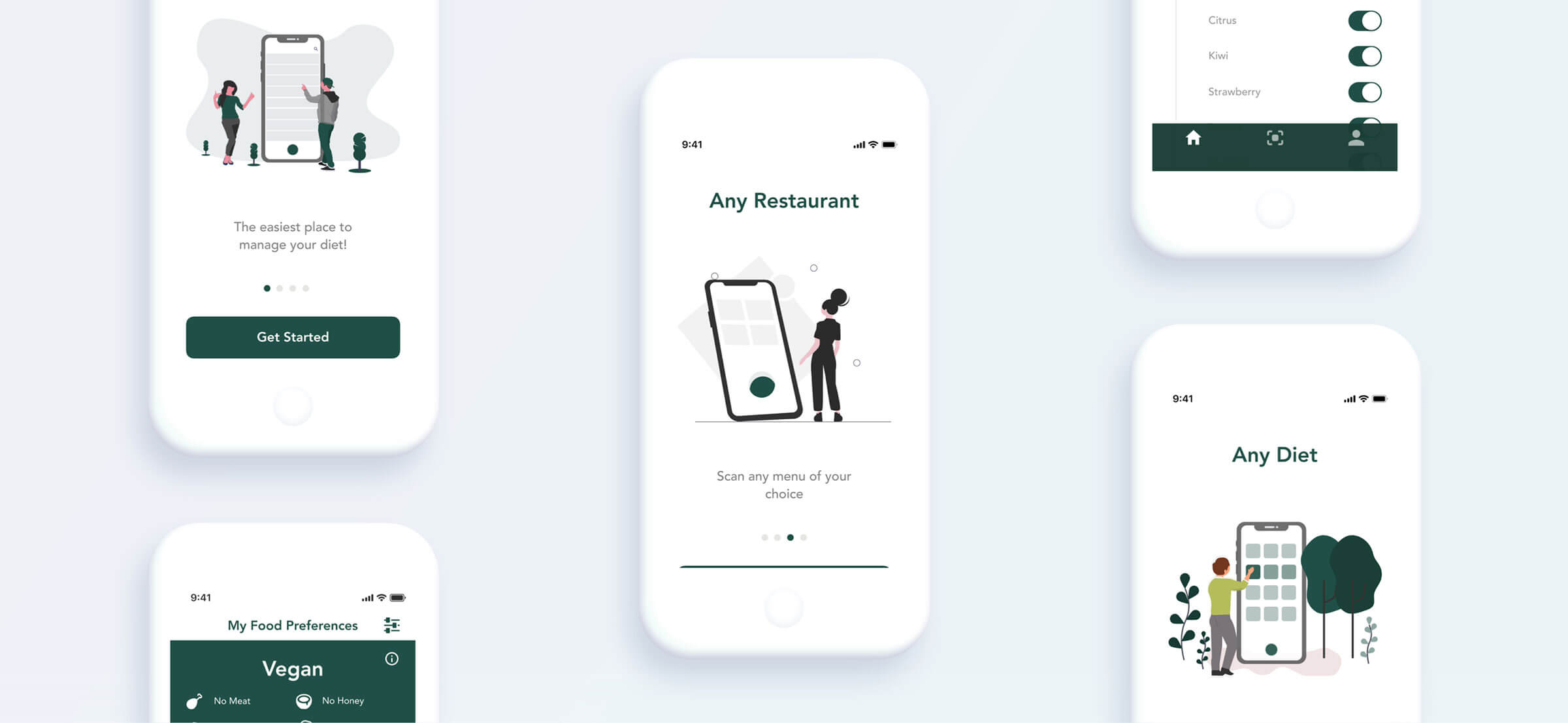
- Add onboarding process to build trust with users
Discovery
Techniques used
- Heuristic evaluation
- Competitive & Comparative Analysis
- 150+ user surveys 8 usability tests
- Contextual inquiry
- 8 user interviews
- 2 nutritionist consultations
Discovering Current Issues
We started our research with a competitive analysis, heuristic evaluation, and usability testing with 8 users to understand current problems and to assess features worth considering for the Heali redesign. We compared Heali’s current beta with 8 competitors in total.
Insight
Heali is the only app offering diet filtering and menu scanning; also the only app not providing calorie information.
Empathizing With users
The next step was to empathize and gain a deep understanding of the users and their impressions of using diet management tools. We utilized a survey and interviews of people with dietary restrictions to get a sense of pain points and opportunities for improvement. In addition, I conducted a contextual inquiry to better understand our users’ behavior.

Affinity Mapping
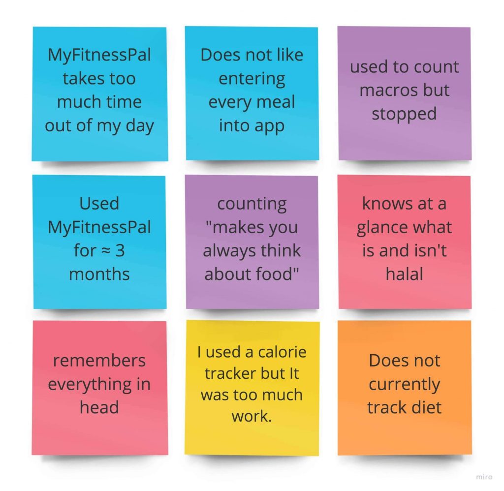
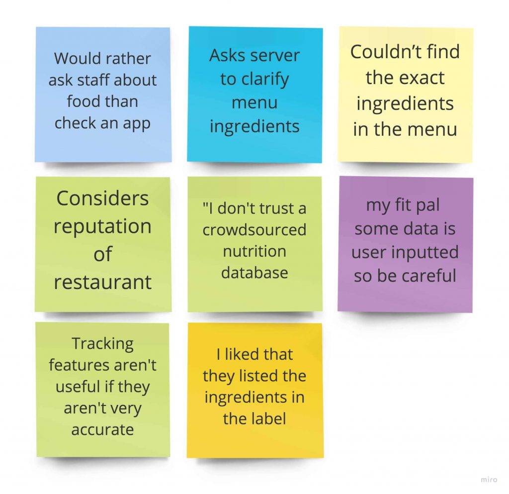
After interviews and surveys, I began to synthesize the data through affinity mapping.
Insights
- All users first research a restaurant to see how the menu fits into their dietary restrictions.
- Most of people turn to services such as Google to educate themselves on nutrition information they are not familiar with. However, there is no guarantee of accuracy from Google.
- Users do not see dietary restrictions as a diet, but as a lifestyle.
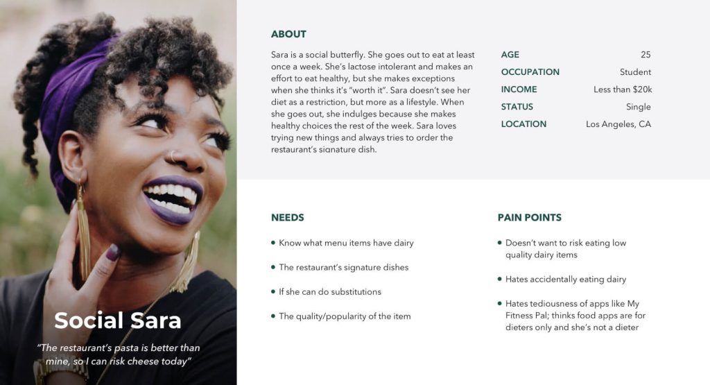
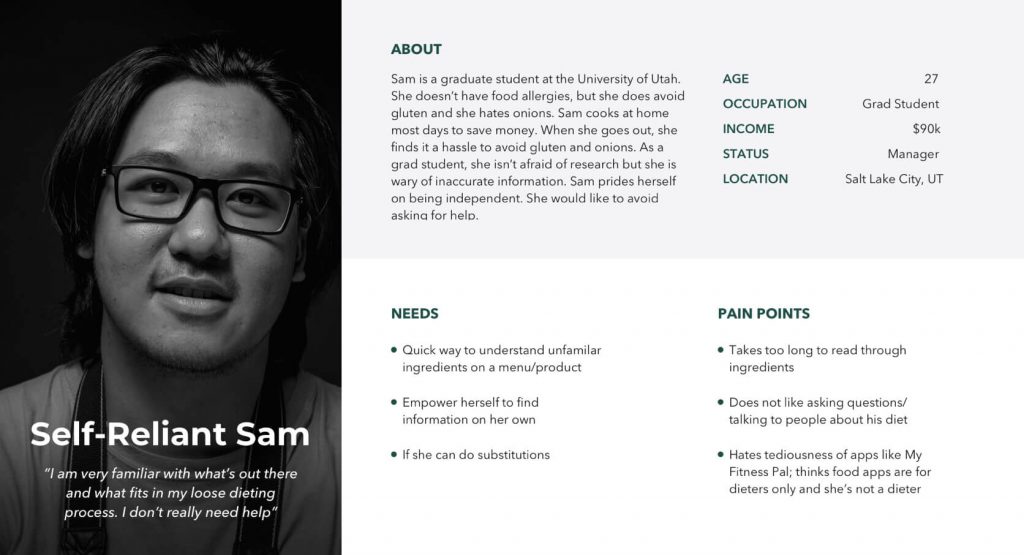
User Personas
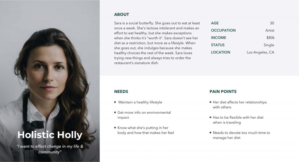
During our research synthesis, we identified three major needs users have for diet management apps: app simplicity, reliability, and accurate nutritional data points. These insights, along with survey demographic data, helped us to create the following 3 personas. These personas then guided many of the choices we made in the design process.
Insight
Even though all three personas are valuable, together with stakeholders we decided to focus our attention on Holistic Holly since she is an extreme user with the most restricted diet. If we can satisfy an extreme user, we can satisfy any user.
Feature Prioritization
Based on the trends we identified during the research, I narrowed a list of demands and features. I used the MoSCow method to prioritize features.
Must-Have
- Update user onboarding flow.
- Add clear instructions on the camera screen.
- Change color combinations to add more contrast.
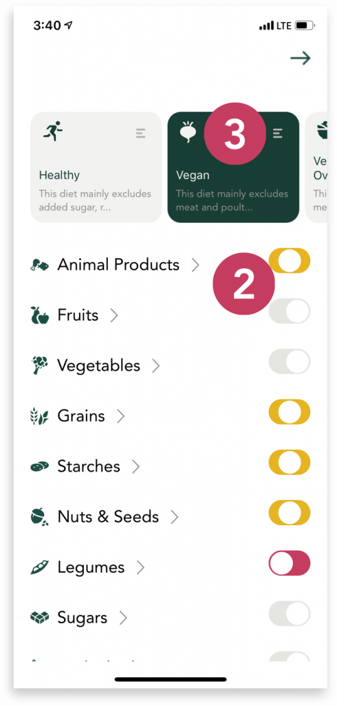
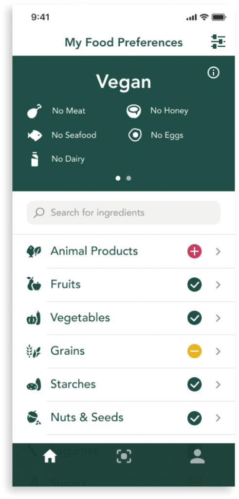
- Replace toggles with color-coded icons.
Should Have
- Add tab bar.
- Add a search bar.
- Ability to add menus from camera roll.
Design
Techniques used
- Design Studio
- Paper Prototype
- Medium Fidelity Prototype
- High Fidelity Prototype
Design Studio
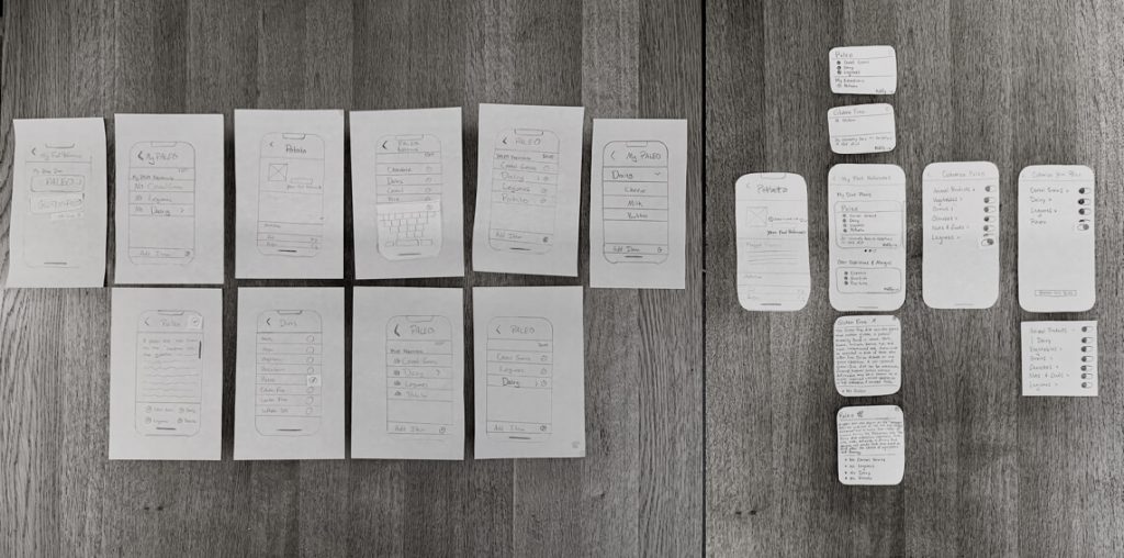
Each member of our UX team sketched their ideas within a time box. Then, we presented our ideas to each other for critique and went back to the drawing board. Through this iterative process, our ideas began to align.

Paper Prototype
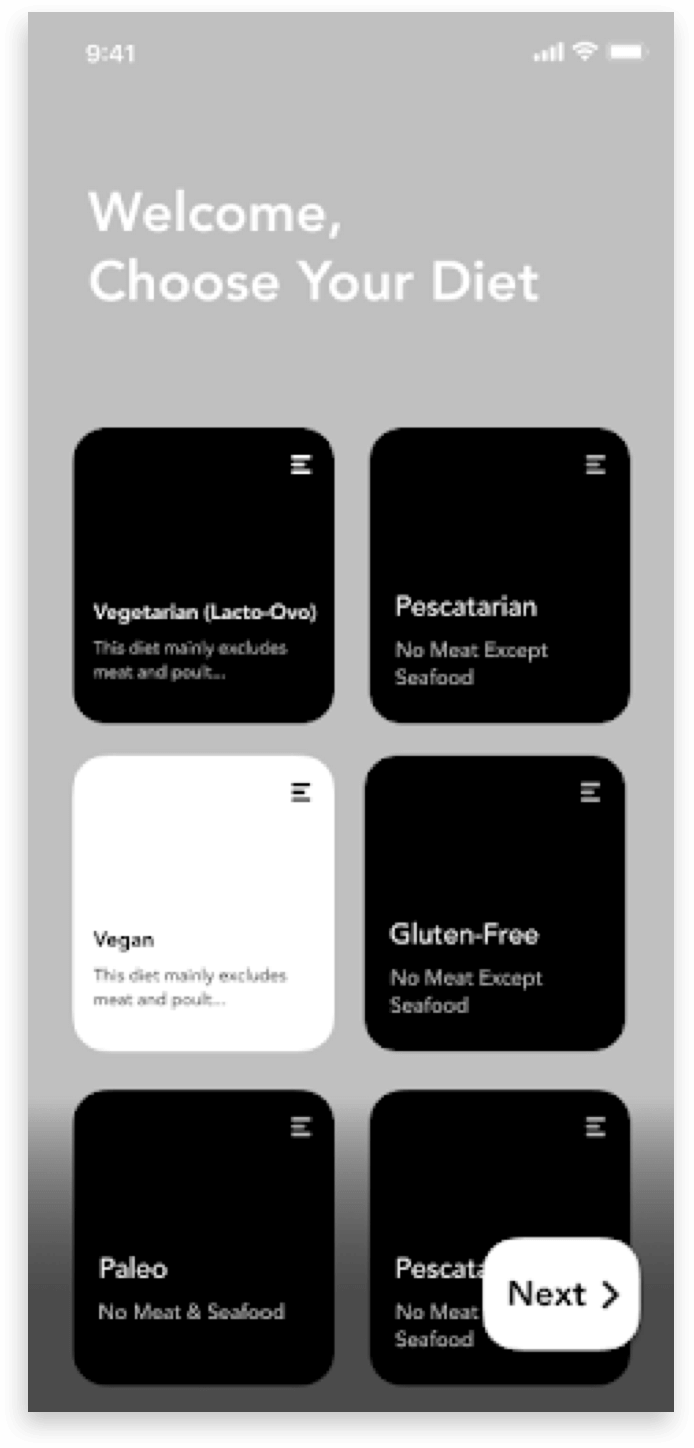
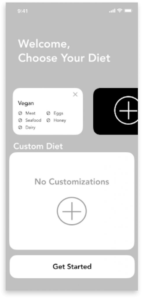
From beta testing, we understood that users were confused because of the lack of directions. However, it was less clear to us how to implement a more approachable diet setup while still orienting the user on their diet. We created two different versions of a paper prototype and tested both designs.
Medium Fidelity Prototype
Insights
- Users wanted a clearer list of what they can and can’t eat.
- When customizing a diet, users were thrown off by the titles of broader food categories.
- Users wanted a more intuitive way to delete diets.
Actions
- Come back to the “food tree” feature.
- Move search bar to the Home screen.
- Add manage diets section
High Fidelity Prototype
In the High Fidelity, I focused on the whole feel of the app. I wanted to ensure the branding and the copy really promoted ‘trust’ to the user.
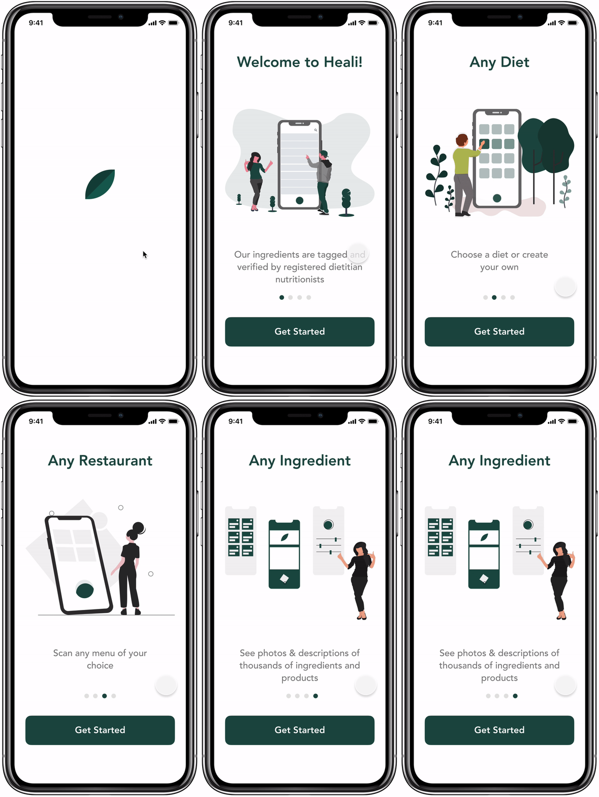
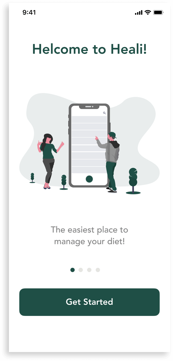
Added a launch screen the moment the app starts, giving the impression that the app is fast and responsive while allowing initial content to load. This screen is quickly replaced by the first screen of the onboarding process.
My goal was to design a launch experience that’s fast, fun, and educational to build trust with Heali’s users.
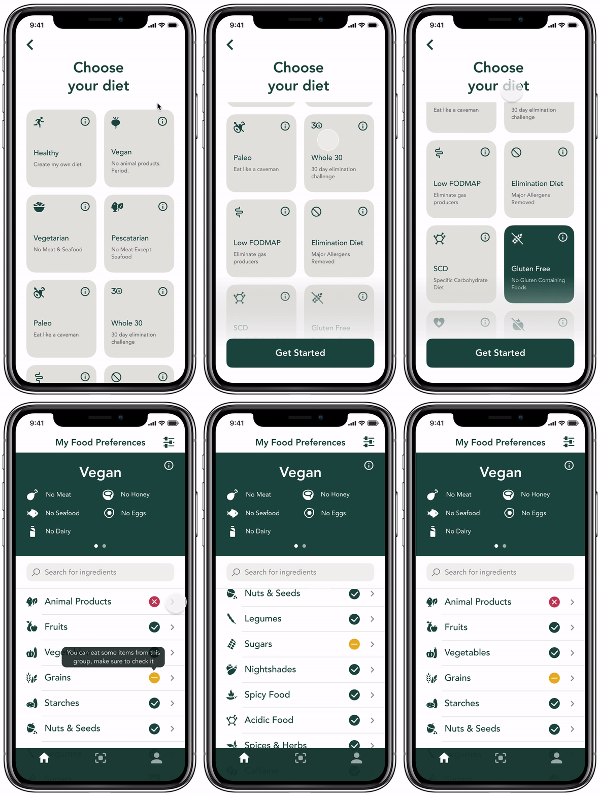
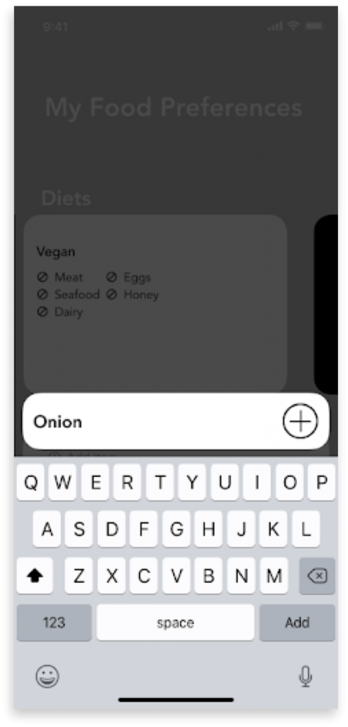
Toggles for main food groups are replaced with color-coded icons. Also, new users will see educational popup tips.

Moved scan icon to the tab bar and provided directions on the scan menu screen. In addition, a big plus button allows users to add menus from the camera roll.
Reflection
One of the “aha” moments during our research was that some users look up the menu online before going to the restaurant. Heali’s menu scan is unique among dietary restriction apps but if users are researching restaurants first, there may be a need to facilitate that research through Heali. This is a great opportunity for the app in the future. However, it was out of our scope for this project. If we had more time we would explore this area more.
I also discovered 7% of respondents were under the age of 15. While these young users may not have a phone for downloading the Heali app, it does raise a case for introducing multiple profiles per account. Families could manage all of their dietary restrictions from one app.
Next Steps
- Product Scan – Build, test, iterate.
- Restaurant Location Search – Pursue research on this new feature.
- Substitution Suggestions – Pursue research on this new feature.
- Multiple Accounts – Pursue research on this new feature.

