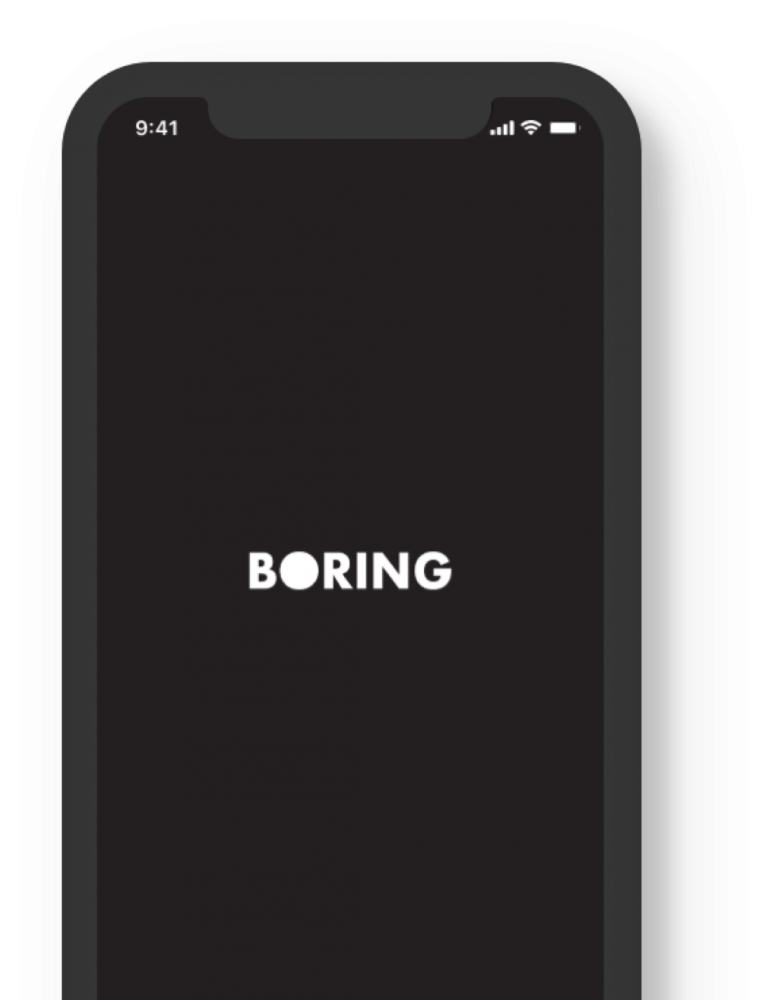
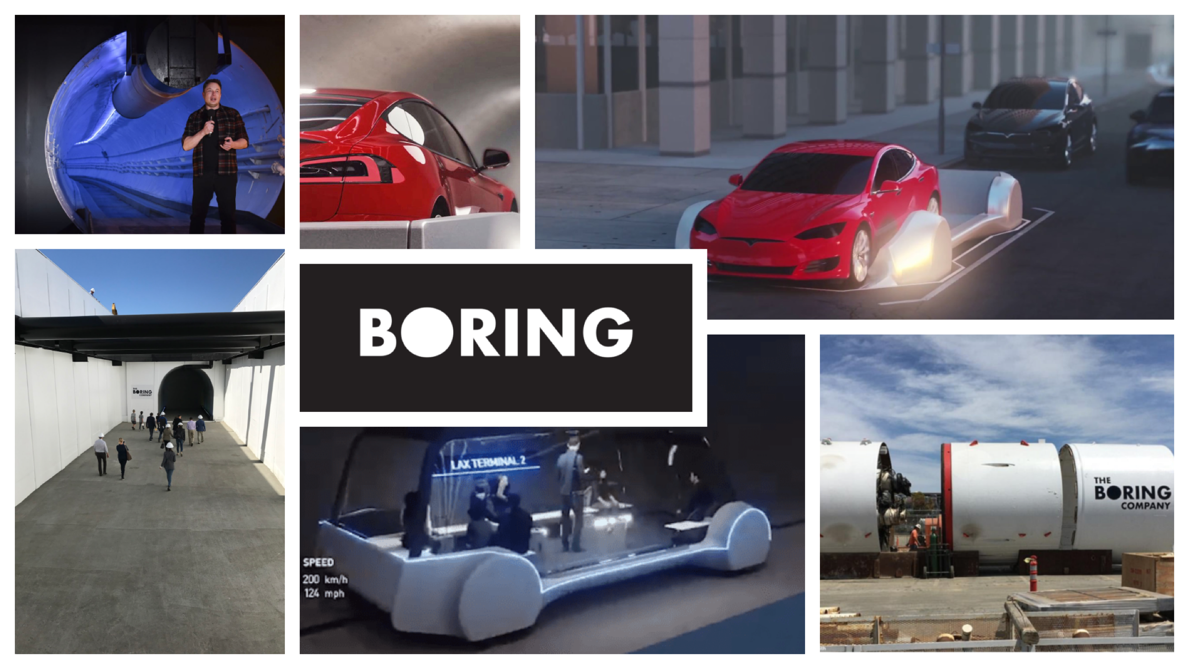
Elon Musk created the Boring Company to solve L.A. traffic congestion. Citizens will have the option to use a vast underground tunnel system that will transport people at speeds up to 150 mph through frictionless tunnels. The experience promises to be a perfect blend of personal and public transportation.
Project: iOS App Design Concept
Timeline: 9 Days
My Role: Lead Designer (Collaborated with Jason Madamba, Jessica Gassner, and Debbie Yen)
Responsibilities: Research, Understanding the problem, User Testing, Brand Style Guide, Prototyping
The Challenge
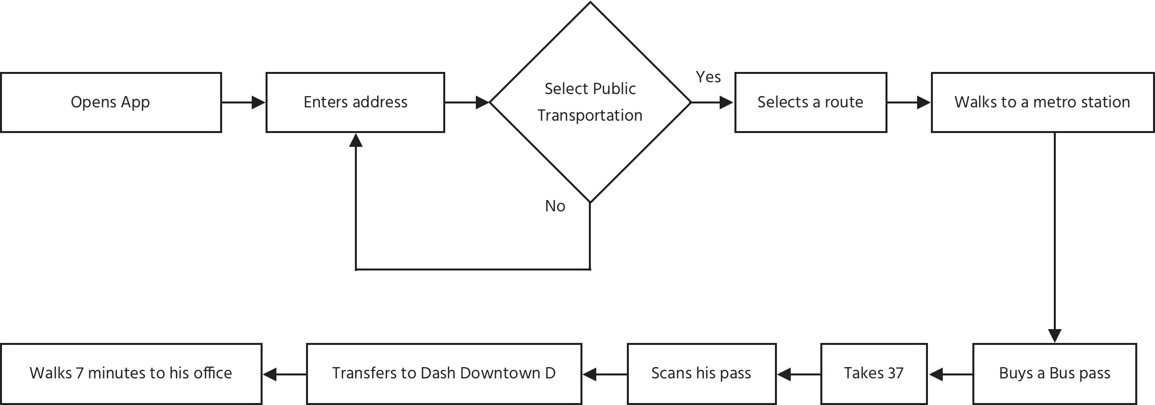
People are frustrated with the Los Angeles public transportation options that are currently out there. So we needed to create an app that provides an intuitive way to access Boring Company’s underground transportation system once it is available for the public to use.
The Solution
Build a native iOS app that effectively communicates what The Boring Company is, and how to use Elon Musk’s high-speed transit system.
Research
Comparative Competitive Analysis
We started with a C&C Analysis of current day transit apps. We wanted to highlight the strengths and weaknesses of products in order to make more informed decisions about Boring product strategy.
Top Three Takeaways:
• Users should be able to create their own personalized accounts • Information has to be both accurate and easy to understand • Payment process has to be simplified as much as possible
Competitive User Flow
Navigation apps are geared towards completing a ‘booking’ as fast as possible. Our tests showed that users took less than 20 seconds to complete this task. We had a new interpretation of what speed meant to us for this project. We learned that the user flow between the different transit apps was almost identical.
Empathizing With Users
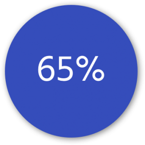
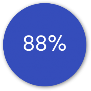
The next step was to empathize and gain a deep understanding of the users and their experience with the current state of transportation and improvements they’d like to see. We received 24 survey responses and interviewed 6 potential users.
Users use public transit at least 2 times a week
of users use Uber or Lyft as their transit app of choice.
Affinity Mapping
Once we collected all data from several different types of analyses, we began synthesizing the data through affinity mapping to identify trends.
I like to know my transportation status at all times.
I want a personalized experience.
I want to be in control of my route’s efficiency.
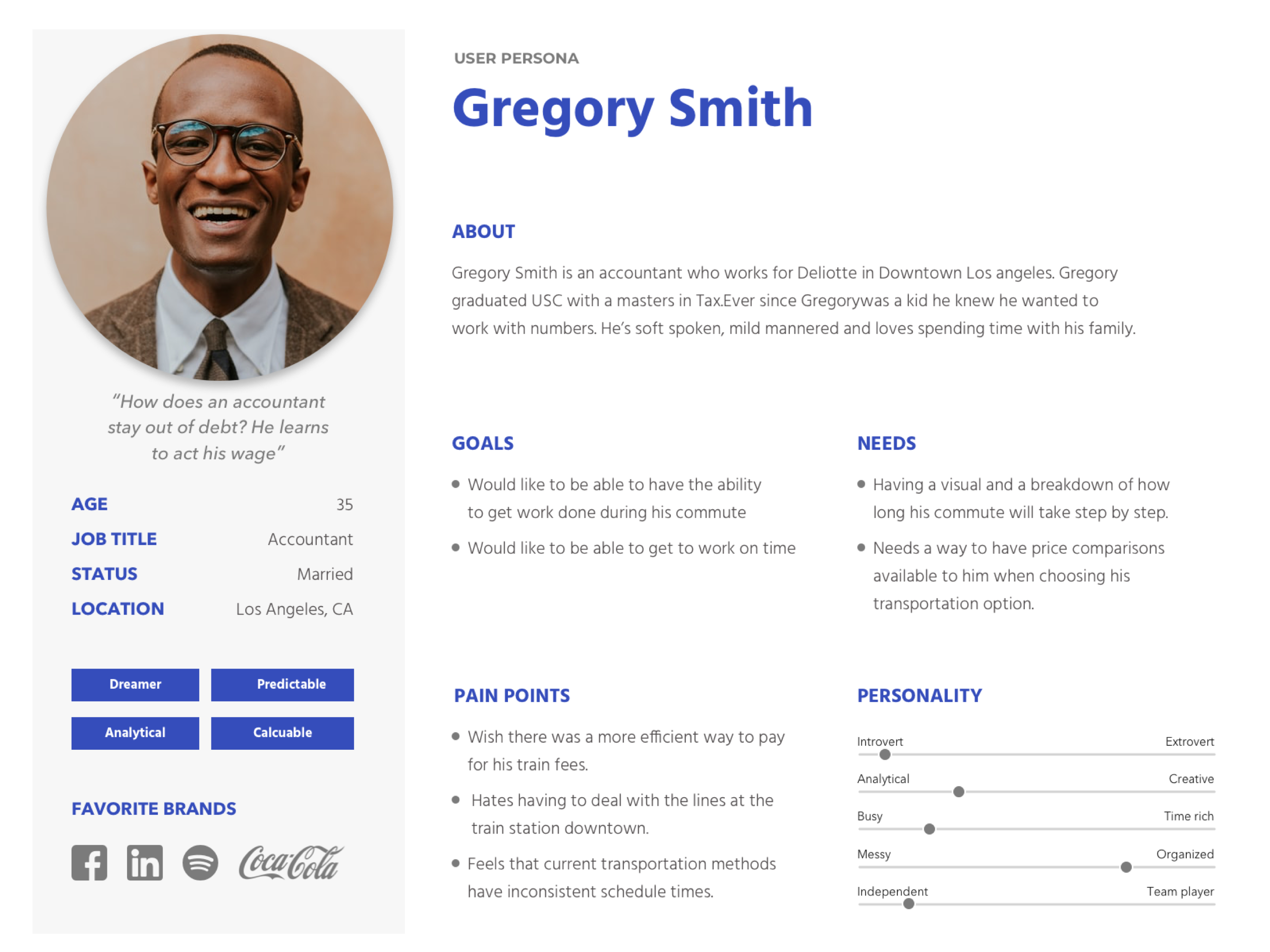
User Persona
From our research data, we created a user persona to determine the type of person we would be designing for.
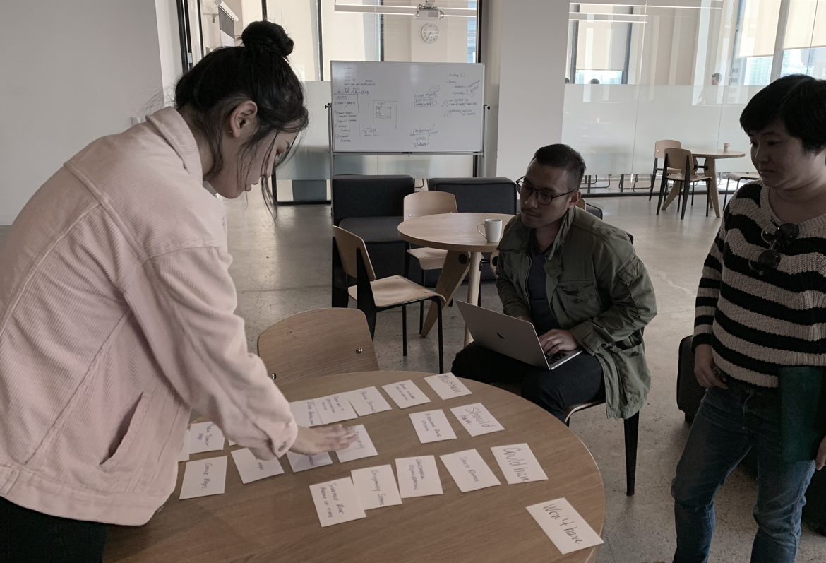
Feature Prioritization
Now that we had a stronger understanding of the competition and our users’ needs and frustrations, we conducted a feature prioritization for Boring. We combined two methods: a card sorting and the MOSCoW feature prioritization to determine which features are really important for people who are going to use the App. We gave users a stack of index cards with one feature per card and asked to sort them from most to least important.
After that we came up with a point system and scored each feature accordingly. In total, we conducted 6 card sort interviews.
Must Have = 4, Should Have = 3, Could Have = 2, Won’t Have = 0
Must Have
• Alerts when vehicle is close • Public transit map • Clear route timing • Electronic Payment
• Occupancy status • Schedule ride in advance • Landmark exploration • Vehicle cleanliness status
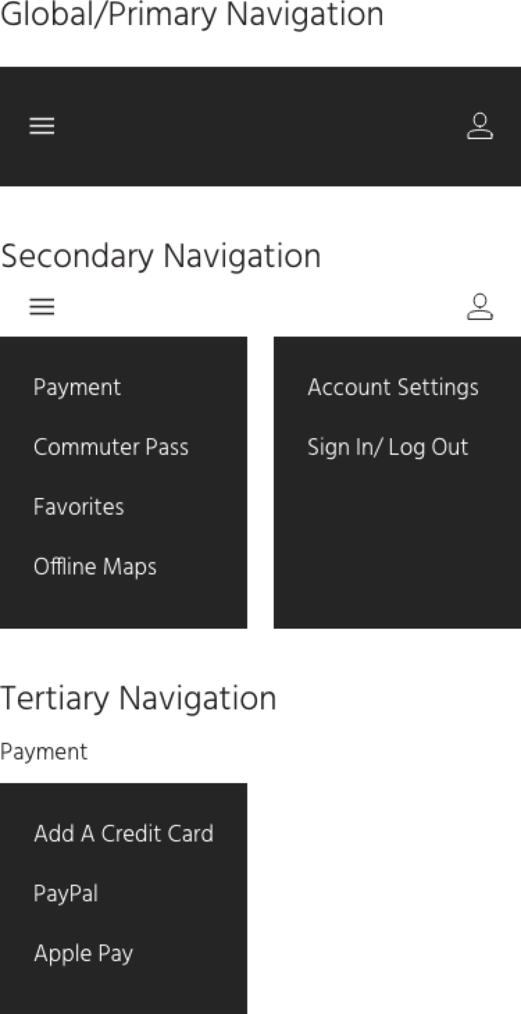
Information Architecture
Ideation
Design Studio
Each member of our UX team sketched their ideas within a time box. Then, we presented our ideas to each other for critique and went back to the drawing board. Through this iterative process, our ideas began to align.
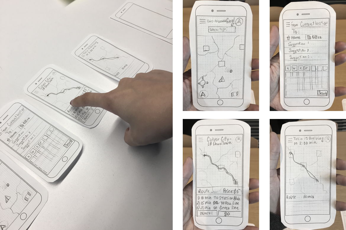
Paper Prototype
We created a paper prototype that we tested with 6 users in person. This process helped us set the overall framework for the Medium Fidelity Prototype.
Insights:
• Overall screen flow was intuitive and easy • Confusing ride breakdown – most thought it was the alternative routes • 50% users had trouble self-locating on map • Call to action buttons will need to be more obvious
Actions Taken:
• Re-did icon placement • Decluttered top layout • Clarified route breakdown • Made my current location easier to find
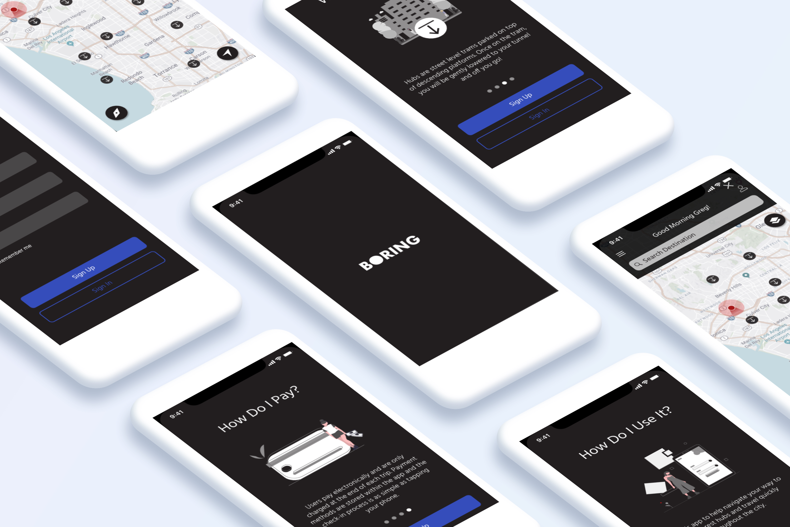
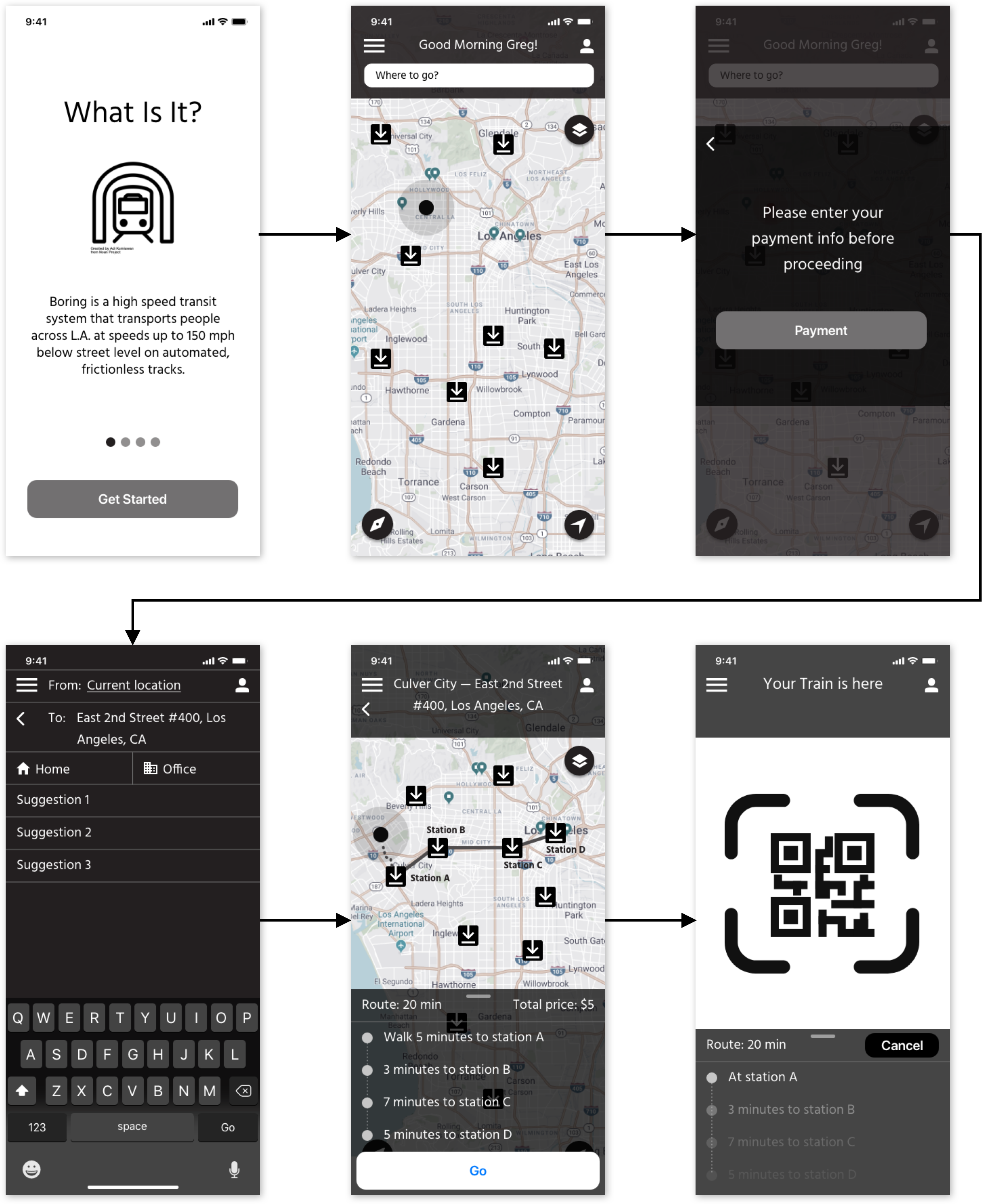
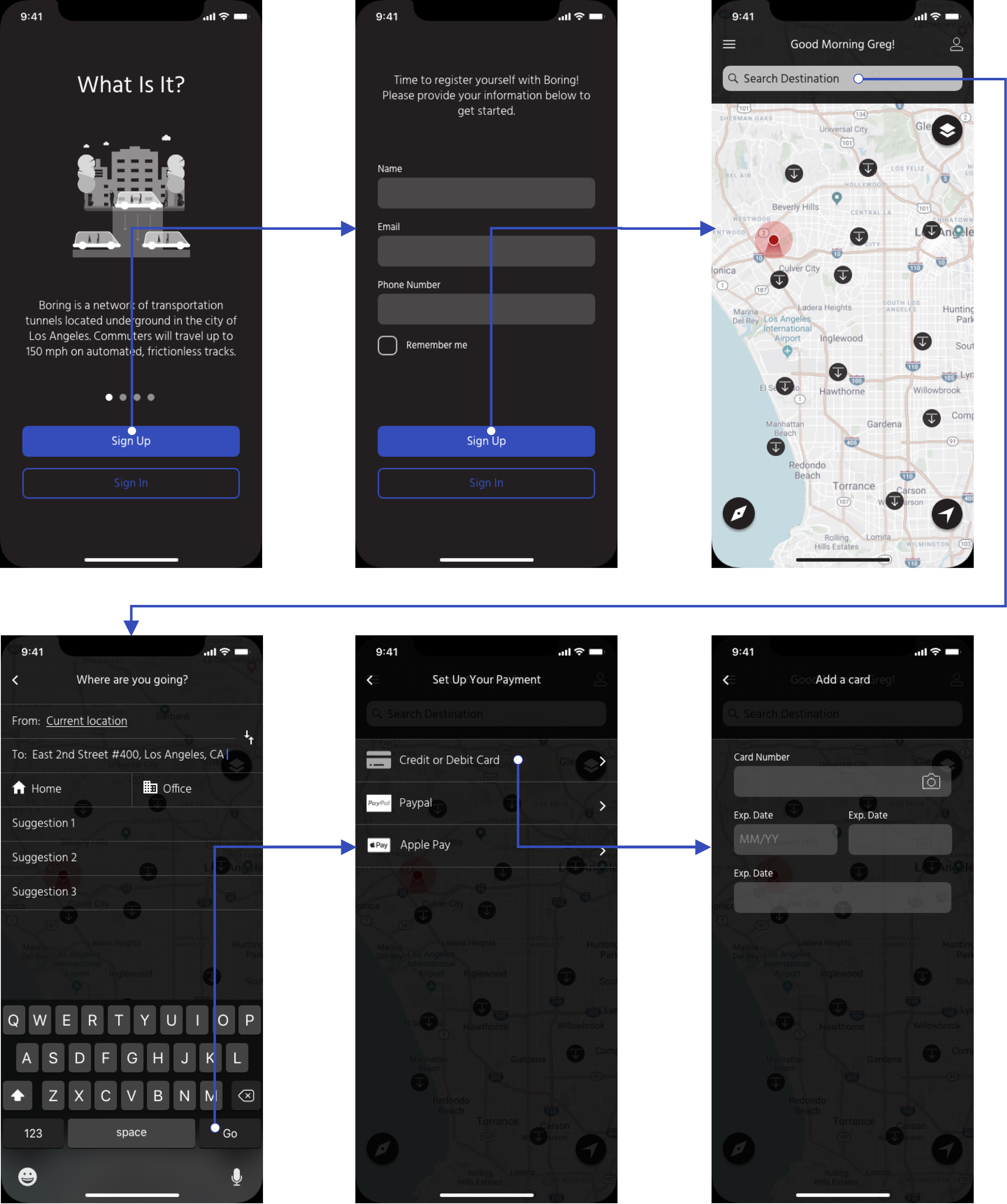
Medium Fidelity Prototype
After iterating on our paper prototype, we developed a mid-fi digital prototype using Adobe XD. We tested the mid-fi prototype with 8 users and following the insights we began working on high fidelity designs and the creation of the final prototype.
Insights:
• Hub icon design too similar to download icon • Need to offer more forms of payment. • Users wanted to explore the app before submitting the required payment • Replace QR Code System • Users wanted to press on Hub icons to see more information
Actions Taken:
• Redesigned the hub icon • Replaced QR code system with ‘tap’ system • Made a hub location clickable • Simplified on boarding Text • Created illustrations for on boarding screens
Visual Design
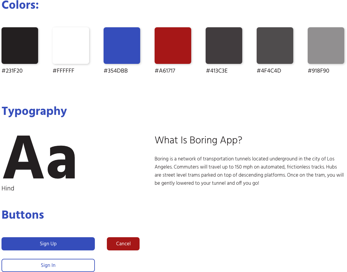
Boring is a product still in works and does not have a current branding. I created a style guide to visualize the final product. This style guide was referenced to build our high fidelity prototype.
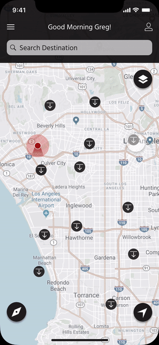
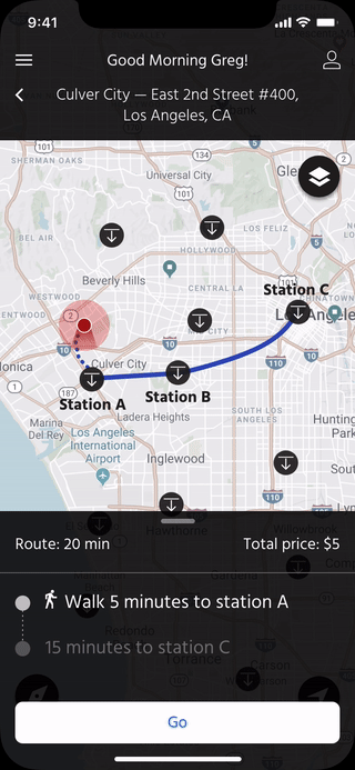
High Fidelity Prototype
We spent the next portion of our process exploring a better user flow to help alleviate the difficulties users were experiencing. We tested the hi-fi with 4 users and discovered the following insights:
Next Steps
• Add transit map overlay on top of the street-level map • Add haptic features as confirmation of successful boarding and payment • Offer a “light mode” version • Price and time comparison for different routes
Reflection
Moving forward, I’d like to continue testing the usability of the Boring App and continue improving and iterating on the designs.